No Products in the Cart




You're probably here because a flowchart that looked fine yesterday now needs one more decision box, one more exclusion path, or one more branch for a revised method section. In a drawing app, that small change often turns into an hour of dragging objects back into alignment. In a paper, thesis, SOP, or validation report, that kind of friction adds up fast.
That's why serious flow chart LaTeX work isn't really about drawing. It's about treating diagrams as part of the document system itself. The chart should compile with the manuscript, inherit the same typography, survive revision, and remain understandable when a colleague opens the source months later.
For academic and technical writing, the difference is substantial. A manually edited figure is a snapshot. A coded figure is an asset you can review, version, and rebuild.
A common approach is to start with whatever is nearest. PowerPoint, Word, a whiteboard export, or a browser-based diagramming tool. That works until the document matters.
Once a figure needs to match the paper's fonts, spacing, notation, and revision history, visual editors become awkward. Text wraps differently after a single edit. Arrow spacing drifts. One copied box keeps a slightly different border or padding. The figure may still look acceptable on screen, but it stops being reliable.
LaTeX changes the model. The flowchart becomes source code. That means you can review edits line by line, keep diagrams under version control, and rebuild them as part of the same manuscript workflow as tables, equations, and references.
In Germany, flow chart LaTeX has a strong connection to reproducible research workflows. A package distributed through Boston College's RePEc archive for FLOWCHART was built to generate publication-quality subject disposition diagrams in LaTeX using PGF/TikZ, and it was designed around the style of CONSORT 2010, STROBE, and PRISMA reporting guidelines. That matters because those diagrams are not decorative. They document inclusion, exclusion, and analysis paths in a way reviewers and readers can audit.
The same documentation also shows a data-driven pattern. Diagram values can be inserted into LaTeX through datatool, so the figure can be regenerated from a variable file rather than redrawn by hand. In practice, that makes a chart easier to trace and easier to update when counts change late in the writing process.
Practical rule: If the figure describes a process that may be reviewed, corrected, or regenerated, write it as code from the start.
A coded workflow usually wins on a few points:
There is a trade-off. TikZ and related tools ask for more discipline up front. You won't get the immediate drag-and-drop feedback of a GUI. But once a project grows beyond a one-off figure, that up-front discipline usually pays for itself.
Package choice affects more than how quickly you can draw the first diagram. It determines how painful the tenth revision will be, how easily a coauthor can edit the figure, and whether you can keep a consistent visual system across a thesis, report series, or methods paper.
In practice, three questions settle the choice early. Do you need precise control over layout? Do the symbols need recognised technical meaning? Will the diagram be revised repeatedly over months or years?
TikZ/PGF is the default for work that needs to last. It gives direct control over node definitions, spacing, connectors, labels, and style reuse. That matters once a figure stops being a one-off illustration and becomes part of a maintained document. You can define styles once, keep them in version control, and update several diagrams from the same conventions.
flowchart is narrower, but it has a legitimate use case. It is built around classic flowchart symbols associated with the IBM Flowcharting Template and aligned with ISO 1028:1973. If symbol semantics matter more than custom layout, that constraint can be useful rather than limiting. Reviewers in technical fields are less likely to debate the meaning of a symbol set they already recognise.
smartdiagram reduces setup time. For teaching slides, internal drafts, or simple overview figures, that can be enough. The trade-off appears later. As soon as the layout departs from the package's assumptions, for example with asymmetric branches, dense annotations, or journal-specific formatting, the saved time tends to disappear.
| Package | Flexibility | Ease of Use | Best For |
|---|---|---|---|
| TikZ/PGF | High | Moderate | Research papers, theses, technical documentation, reusable diagram systems |
flowchart |
Moderate | Moderate | Standardised process charts, formal technical diagrams |
smartdiagram |
Lower | High | Quick drafts, simple presentation figures |
Use TikZ/PGF if the diagram is part of a document you expect to revise, submit, or hand off to someone else. It asks for more explicit code at the start, but that explicitness is what makes later edits predictable.
Use flowchart if the main requirement is conventional flowchart notation and the layout itself is fairly ordinary.
Use smartdiagram if speed matters more than control and you can accept the package's defaults.
One pattern is worth avoiding. Authors often begin with a convenience package, then patch over its limits with custom TikZ commands. That creates the maintenance burden of TikZ without the clarity of a clean TikZ source. If you already know the figure will need manual adjustment, start with the tool that exposes the layout directly.
Another poor selection rule is line count. Shorter code is not automatically better code. For diagrams that may be audited, updated, or reused, explicit node names, named styles, and visible positioning logic usually produce a figure that survives revision with less effort.
If you want one reliable starting point, use TikZ/PGF with explicit node styles and arrows. For technical diagrams, that remains the most dependable method. A practical guide at Bert Van den Broucke's TikZ flowchart tutorial recommends using TikZ with shapes.geometric, which aligns well with standardised, publication-grade process diagrams.

A minimal example is enough to learn the core pattern. Put this in a small test document first, not in the middle of a large thesis file.
\documentclass{article}
\usepackage{tikz}
\usetikzlibrary{shapes.geometric, arrows, positioning}

\tikzstyle{startstop} = [ellipse, draw, align=center, minimum height=10mm]
\tikzstyle{process}   = [rectangle, draw, align=center, minimum height=10mm, text width=35mm]
\tikzstyle{decision}  = [diamond, draw, align=center, aspect=2, inner sep=1pt, text width=22mm]
\tikzstyle{arrow}     = [thick,->,>=stealth]

\begin{document}

\begin{tikzpicture}[node distance=12mm and 18mm]
\node (start) [startstop] {Start};
\node (step1) [process, below=of start] {Collect sample metadata};
\node (check) [decision, below=of step1] {Data complete?};
\node (fix) [process, right=of check] {Request missing information};
\node (end) [startstop, below=of check] {Proceed to analysis};

\draw [arrow] (start), (step1);
\draw [arrow] (step1), (check);
\draw [arrow] (check), node[anchor=east] {Yes} (end);
\draw [arrow] (check), node[anchor=south] {No} (fix);
\draw [arrow] (fix) |- (step1);

\end{tikzpicture}

\end{document}
This structure is simple, but it already demonstrates the habits that scale well: styles are named, node placement is relative, and arrows are separate from node definitions.
The preamble does three jobs:
Inside tikzpicture, each \node creates one shape with a name such as start or check. Those names matter because arrows connect named anchors, not guessed coordinates.
The line below=of start is more important than it looks. Relative placement means you can insert another block later without recomputing the whole page by hand.
A visual walkthrough can help if you prefer to see the drawing process in motion.
Beginners often over-focus on shapes and under-focus on labels. Keep the text inside nodes short. Put detailed explanations in the caption or surrounding prose unless the diagram itself is the primary object of study.
Also, name nodes for meaning, not for position. check_metadata ages better than diamond2. When the layout changes, the semantic name still makes sense.
Once a chart has more than a few nodes, layout discipline matters more than decorative styling. Most broken TikZ flowcharts aren't ugly because of colour choices. They're hard to read because spacing is inconsistent, connectors bend awkwardly, and labels force manual repairs across the figure.
For larger diagrams, two libraries matter a great deal: positioning and calc. Tutorial guidance in this TikZ flowchart layout walkthrough on YouTube shows why. They let you specify block distances and calculate line anchors automatically, which helps avoid overlapping nodes and uneven connector geometry.
Hard-coded coordinates look precise, but they become brittle quickly. If one node grows because a label becomes longer, all downstream coordinates may need adjustment.
With positioning, the code stays descriptive:
\usetikzlibrary{positioning,calc}

\node (ingest)   [process] {Ingest data};
\node (validate) [decision, below=of ingest] {Valid?};
\node (reject)   [process, right=25mm of validate] {Reject batch};
\node (store)    [process, below=of validate] {Store sample};
That reads like the diagram's logic, not like a set of plotting instructions.
A maintainable chart says where things are in relation to each other, not where they happened to sit on one afternoon.
\tikzset
A production-safe diagram library starts with reusable styles. Don't redefine the same rectangle five times.
\tikzset{
  base/.style={draw, align=center, minimum height=10mm, font=\small},
  process/.style={base, rectangle, text width=34mm},
  decision/.style={base, diamond, aspect=2, inner sep=1pt, text width=24mm},
  terminal/.style={base, ellipse, text width=22mm},
  flow/.style={->, thick, >=stealth}
}
This pays off when a supervisor wants all process boxes wider, or when a journal template makes your current font size look cramped. You change one style definition, not every node.
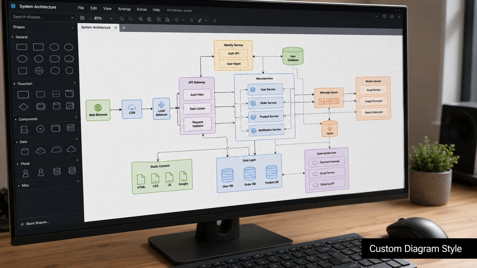
For branch-heavy charts, connector quality affects readability more than almost anything else. Orthogonal lines are often easier to follow than diagonals in technical documents.
The calc library helps when anchors need cleaner routing:
\draw[flow] (validate), (store);
\draw[flow] (validate.east), ++(8mm,0) |- (reject.west);
\draw[flow] (reject.north) |- ($(ingest.east)+(10mm,0)$) |- (ingest.east);
That kind of routing is worth the extra effort in methods diagrams, SOPs, or architecture figures where readers need to trace the process confidently.
The same tutorial guidance also stresses setting a minimum height and letting node height adapt to content. That's a small but important habit. If labels change length, boxes remain visually coherent instead of collapsing into mismatched rows.
A polished flowchart usually comes from constraint, not ornament. Standard node dimensions, consistent spacing, and predictable arrows do more for professionalism than gradients or decorative effects.
Most tutorials stop at “here is how to draw a box and connect it to another box”. That's fine for a homework example. It's not enough for a dissertation, a recurring report, or a shared technical repository.
A common gap in flow chart LaTeX guidance is production safety for collaboration. The practical issue isn't whether you can draw one diagram. It's whether the diagram still makes sense after revision, review, and handover. An article on making flowcharts in LaTeX with maintainable workflows points to that exact gap and recommends moving away from copy-paste templates towards reusable tikzset{} styles and version-controlled workflows.
The best diagrams in long documents are modular. Keep substantial TikZ figures in separate files and pull them into the main document with \input{}. That makes the manuscript cleaner and lets you reuse the figure elsewhere.
A sensible project layout might look like this:
\tikzset{} definitions and any custom commands.That structure reduces clutter and makes review easier. A co-author can inspect one diagram file without searching through an entire chapter.
Naming is where many collaborative TikZ projects become unreadable. Use stable, semantic names for nodes, styles, and commands.
Good examples include:
eligibility_check, sample_storage, qc_review
process_node, decision_node, terminal_node
\FlowProcess, \FlowDecision
Avoid names tied only to layout, such as leftbox, box3, or arrowA. Those names become misleading as soon as the figure changes.
Comments matter too, but comment the reason, not the obvious syntax. “Route around decision branch to keep yes/no labels unobstructed” is useful. “Draw arrow to next node” is not.
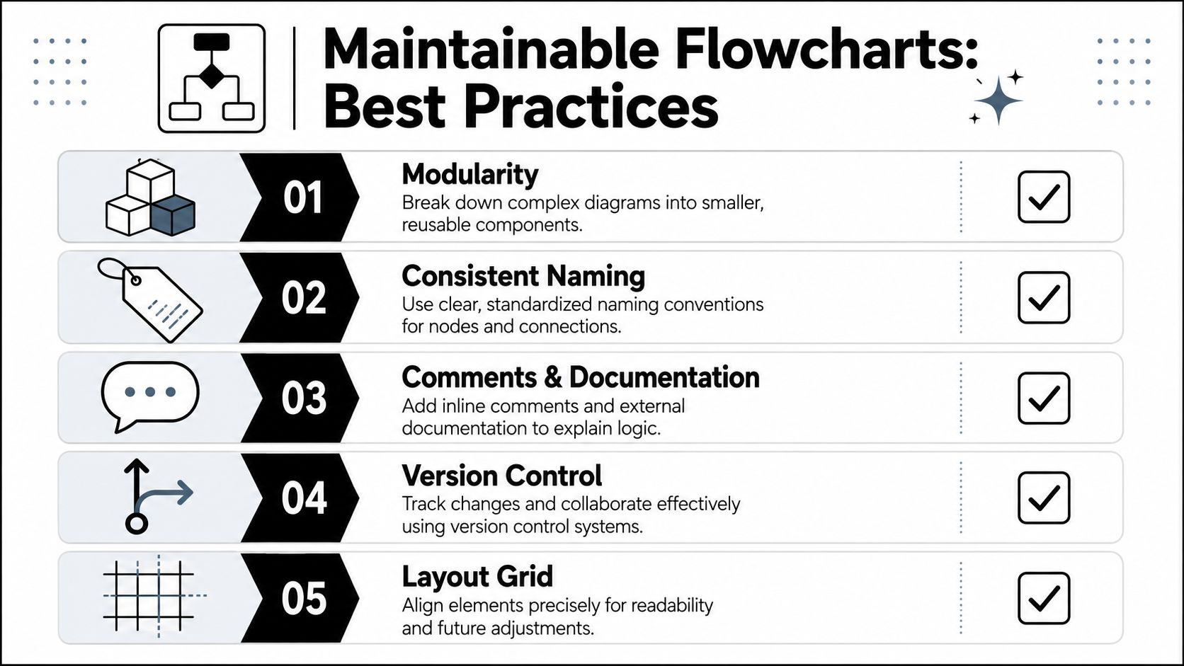
Review habit: If a colleague can't tell what changed in a figure from the diff, the diagram code probably needs better structure.
Three habits cause most maintenance pain.
First, copying a complete old figure and editing it into a new one. That spreads tiny inconsistencies across a project.
Second, embedding every styling choice inline. It feels fast until the style needs to change globally.
Third, using manual coordinates for everything. The chart may compile, but each revision turns into fragile geometry work instead of document editing.
A common failure point is not the diagram logic, but the build step. The chart looks reasonable in the editor, then LaTeX stops on a vague TikZ error, or the figure shifts after a package update. For project work that needs to compile again six months later, the goal is a repeatable build and a debugging routine that isolates faults fast.
Start with the same engine and build path every time. For most TikZ flowcharts, pdflatex is enough. If the document already depends on latexmk, use it consistently instead of switching between editor buttons and ad hoc command-line runs. Reproducibility matters here. A diagram that only compiles in one editor profile is harder to maintain than one that builds from a plain command.
If a figure fails, reduce the problem immediately. Compile a minimal file with the preamble, required libraries, and one tikzpicture. That tells you whether the error belongs to the figure itself or to an interaction elsewhere in the manuscript.
TikZ statements end with semicolons. One missing semicolon often triggers an error several lines later, which makes the reported line misleading. Check the line before the error first.
If below=of fails, load positioning. If a shape is unknown, load the corresponding TikZ library or package that defines it. Many “unknown key” and “I do not know the shape” errors come from omitted libraries rather than broken syntax.
Connector code fails easily when a node name is misspelled, an anchor is wrong, or a bend path became invalid after a layout edit. Test the connection as a simple straight path first. Then add bends, labels, and offsets one step at a time.
One practical habit improves long-term reliability. Keep a tiny standalone test file for your diagram styles and one representative flowchart. After TeX Live updates or package changes, compile that file before touching the full manuscript. It catches compatibility problems early and protects publication figures from last-minute build surprises.
You can, and sometimes it helps for rough drafts. But generated TikZ is often verbose and hard to maintain. For long-term projects, hand-written or heavily cleaned TikZ is usually better because the structure stays readable.
Reduce node text first. Wide diagrams often reflect overlong labels rather than true layout needs. If the logic is indeed broad, split the figure into stages or move recurring details into a legend or caption.
-- path and more complex path syntaxA straight path is fine for simple connections. More explicit path forms become useful when you need bends, orthogonal routing, labelled branches, or calculated anchor positions. Use the simplest path that keeps the chart readable. Don't make every connector clever.
If your flowcharts describe sample handling, storage decisions, transport pathways, or laboratory process controls, the diagram is only one part of a larger operational system. Cryonos GmbH supplies cryogenic storage, transport, and handling solutions for laboratories, biobanks, hospitals, and industrial users who need reliable, compliant infrastructure behind those documented workflows.

